Appearance
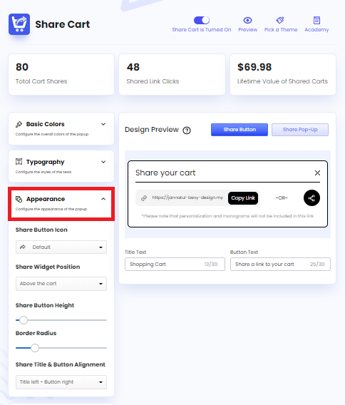
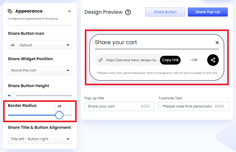
Share Cart offers a bunch of powerful customization features through which we can configure the appearance of specific Share Button and Pop-Up elements. To access these features from Share Cart Dashboard, we have to go to Design > Appearance and click on the drop-down.
We can configure the following settings with the help of this section:
- Share Button Icon: Let us edit the Share Button Icon. The Share Button Icon is set to a stylish arrow by default. However, we can remove the icon or change it to a different one from a list of available icons to match our needs.
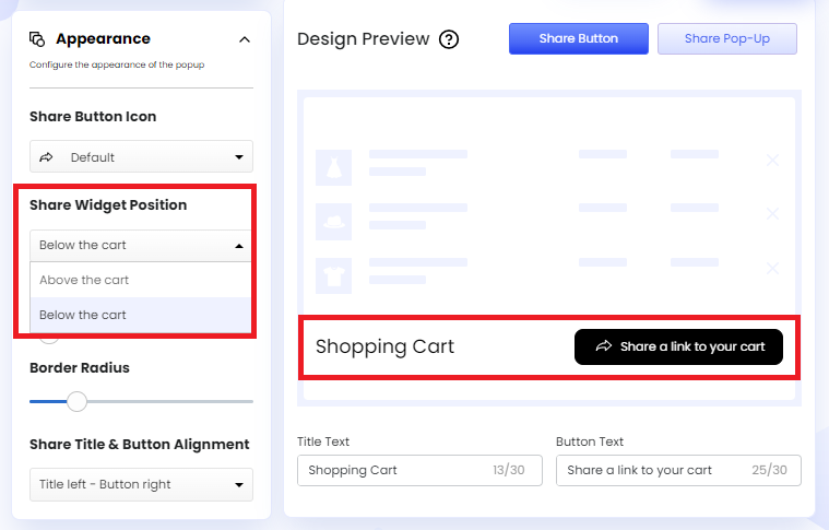
- Share Widget Position: Let us edit the position of the Share Widget. We can place the widget either above or below the cart.
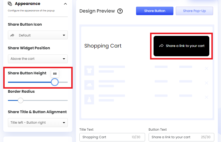
- Share Button Height: Let us edit the height of the Share Button through a slider.
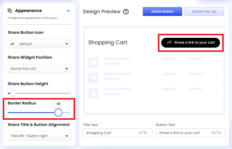
- Border Radius: Let us edit the border radius of the Share Button and Pop-Up through a slider. We can add roundness to the borders using this option.
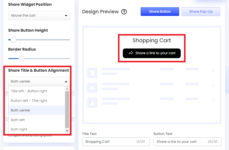
- Share Title & Button Alignment: Let us edit the alignment of the Share Title and Share Button. We can align them in the following ways:
- Title Left - Button Right: Select this option to place the Share Title on the left and the Share Button on the right.
- Button Left - Title Right: Select this option, to place the Share Button on the left and the Share Title on the right.
- Both Center: Select this option to place the Share Button and Share Title on the center.
- Both Left: Select this option to place both the Share Button and Share Title on the left.
- Both Right: Select this option to place both the Share Button and Share Title on the right.
We hope you make the most of Share Cart’s Appearance features to match your requirements.
If you have any questions, contact us via live chat or email at [email protected].

